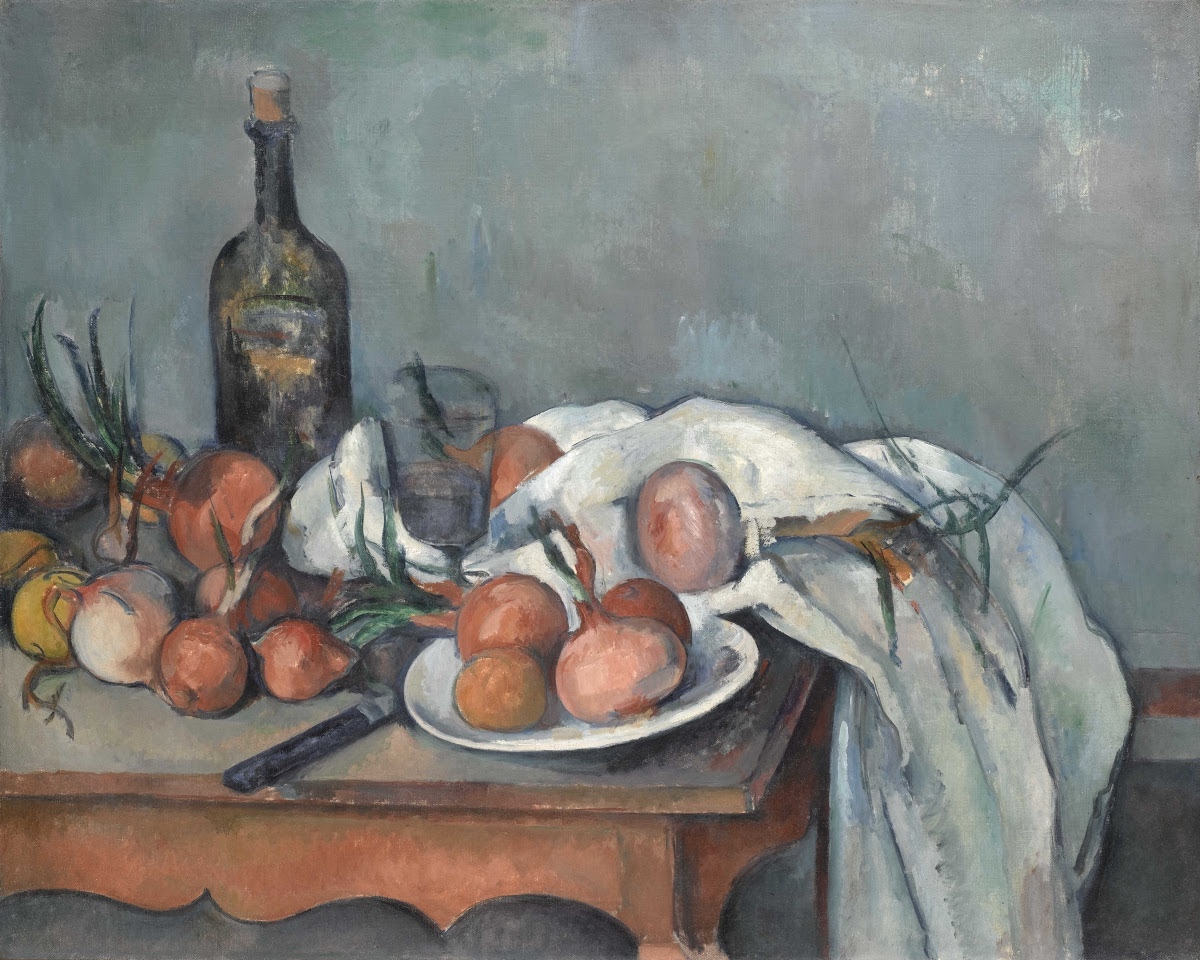
Oil on canvas (1896-98)
French artist, Paul Cezanne, is generally seen as one of the most influential painters of still life. In his search for a balanced composition, he would distort shapes and shift viewpoints, so much so that he became an influence on Cubism and the path towards abstraction. Take the glass in this painting for example. The front side seems to be drawn straight across, on our eye line, whereas the back rim of the glass is curved, suggesting that we are looking down from above. We can see this shift in view point with the table top too. It looks like the onions should be rolling forward, on to the floor! It is generally thought that Cezanne was not only doing this to aid the balance of his composition, but also to show more. He tilted surfaces towards the viewer, so that we can see what is behind the front objects.
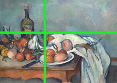
Cezanne has also created a series of interconnecting shapes that direct the viewer’s eye along pathways, moving along the surface of the canvas. He has given us a few pathways into this painting; we can slide down the sprouting onion on the left, or along the knife handle, or even climb up the cloth on the right. Once into the painting, we can dance around the circular onion forms, the elliptical plate and the folds in the cloth, only to take a rest when we meet the edge of the glass or the bottle. Even the curves under the table maintain the rhythm and flow of the painting.
Whereas Cezanne has used the Golden Section to divide the vertical space of the painting (1:1.618 / approximately a ratio of 2:3), the horizontal space has been arranged in a more unusual way. It is the glass that sits in the Golden Section rather than the more imposing bottle.
In terms of the composition of the colours, Cezanne has created a sense of depth from the front of the painting to the back with the use of warm and cool colours. The blue grey colour recedes, whereas the warm browns comes forward. Cezanne has also used colour to connect the objects. You will find a hint of the background blue grey appearing on the cloth and the onions too. Everything feels like it belongs in the same scene. Nothing jolts. One section blends into the next.
Khan Academy looks into Cezanne’s compositions in more depth here.
If you would like to go and see some of Cezanne still lives, check out the National Gallery and the Courtauld Gallery in London.
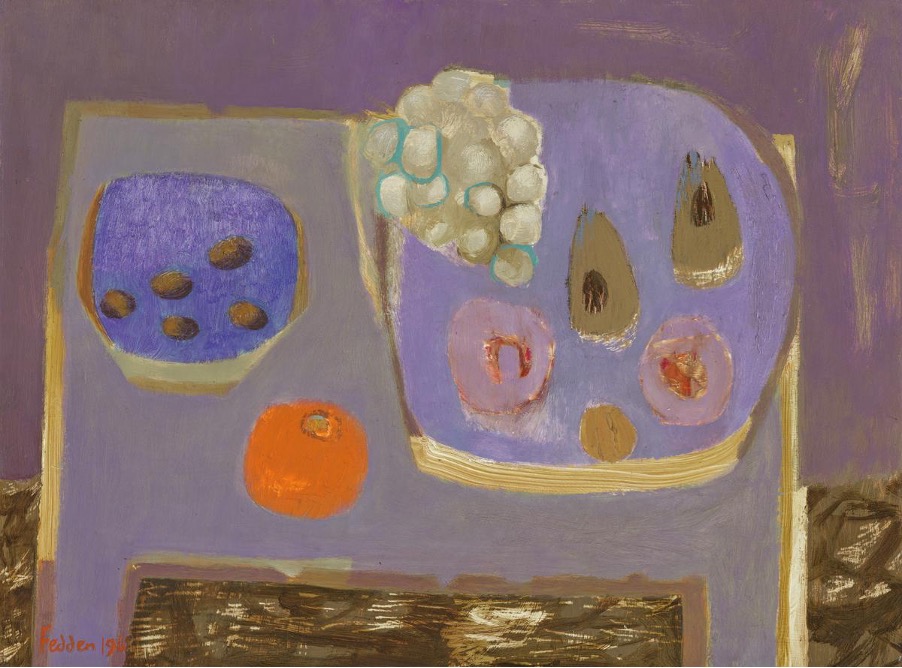
Mauve Still Life – Mary Fedden
Oil on board (1968)
In ‘The Art of Mary Fedden’ DVD, Fedden talks about how she makes paintings based predominantly on just one colour. Standing in her studio, she points out a red painting, a green painting, and so on. Her paintings are great examples of how limiting a painting to one main colour, and a few supporting colours can aid composition,
Fedden’s still life paintings, like Cezannes, are carefully arranged so that each shape floats within the picture surface. Everything is balanced. A nice learning activity on this subject is to cut out coloured paper shapes for each object in the still life, place them on a surface, then move them around until a feeling of balance and harmony is acheived. Also like Cezanne, Fedden sacrifices a bit of reality in order to achieve her compositions.
If you like the work of Mary Fedden, then you might like to look at the work of Matisse too, or past president of the Royal Watercolour Society, Jill Leman.
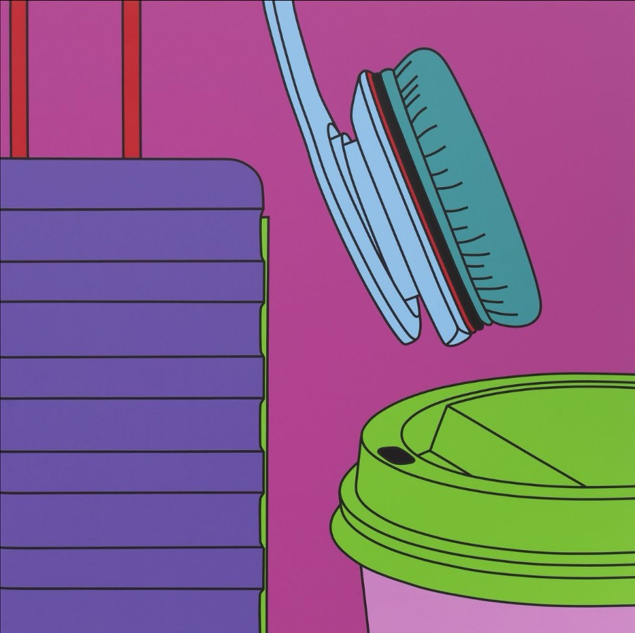
Acrylic on Aluminum (2020)
Having tutored the Young British Artists at Goldsmiths back in the 1980s, Michael Craig Martin has since made paintings, prints and sculptures in the style above for over next thirty years. They are about everyday objects, produced in a minimal, Pop Art style, with bright, eye-catching colours.
The placement of the objects on the painting surface, along with the precise application of the paint and careful choice of resonating colours, all elevate the perceived value of the objects being portrayed. They might make us think of glossy adverts aiming to sell us desirable items.
Craig Martin’s eye level is nearly always directly in front of the object he is portraying; we are on the same level as them, neither looking upwards or downwards. He positions groups of seemingly unrelated objects, or sometimes just a single object on its own, so that each shape in the painting sits in harmony with each other, as well as within the boundary of the picture edge too. Everything feels like it is floating space, just like in Cezanne and Fedden’s paintings.
In this 7 minute video you’ll see this painting displayed on the wall of the Reflex Gallery in Amsterdam. Craig Martin talks about how he made the works, as well as giving some insight into his painting practice.
If you like Craig Martin’s work, you might also like to research the work of Lee John Phillips and Julian Opie.
Also, a list of things to consider when setting up a still life, from colour palette to the arrangement of objects.
More about composition in still life, from the Artists and Illustrators Magazines.
A really nice, ‘Are you making these mistakes’ blog post by Will Kemp’s Art School and a very useful book showing how Cezanne built up his watercolours with just three colours.
And finally, for beginners and young children, this video might prove useful.