Written by Paul Regan ©paulregan.studio 2026

When looking to show distance in landscape painting, and to some extent, portraiture (get that tip of the nose coming forward), and still life, composing a scene using perspective, and having foreground objects overlapping the ones behind is a good start, but also using warm, intense (high chroma) colours, strong contrast, big brush marks and more detail for the foreground, and the opposite for the background, will make a big difference too. The three landscape paintings included on this page use some or all of the these attributes.
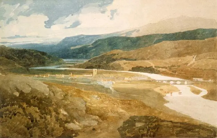

Apparently (but don’t quote me on this), the far distant landscape appears as blue because it’s the only colour that can travel that distance through the moisture in the air, to the viewer. Red travels the next furthest, with yellow travelling the least.