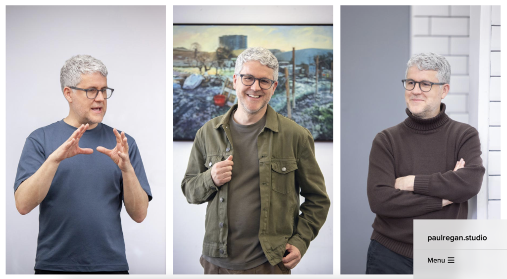
There’s a lot of change going on. After 23 years, I’m no longer running Insight School of Art, my children are no longer children, and I’m about to dedicate more time to my own painting. To consolidate all this, and to mark the new me, I’ve gone and got myself a new website!
The process of designing a new website was a lot of fun. I enjoyed working again with web designer Jeremy Walker of Degas Guruve. I feel we compliment each other well: I get excited showing him lots of sketches of what I want, he leaves a short silence, chuckles to himself a bit, then gently guides me towards what’s actually possible.
Designing a website about ourselves isn’t an easy thing to do. It was important for me to work with a designer who knows me, to encourage me to step forward when I’m hold back, and to hold me back when I’ve gone too far. The design process really requires us to think about who we are, inside and out, and ask ourselves what it is that we actually do, and what we want people to know about us. I wanted a fairly minimal, clean website that, in equal parts, showed the three art hats I wear; painter, mentor and teacher. Within this, I also wanted to include my blog, and a page to share the learning resources I produce for students and teachers.
I spent quite a bit of time looking at other websites to get ideas. I was attracted to websites that gave me a bit of a fun experience, and ones that were different to what I expected to find. I was inspired by the websites of artists Jon Burgerman (especially on a phone) and Shantell Martin, hairdresser John Birchall, designers Dan Mall and Christiana Araujo, makers Maison Nicole and galleries Rhodes Contemporary and Unit. The benefit of working with a good web designer like Jeremy is that once they know what you are looking to achieve, they will send plenty of relevant sites to investigate.
Having been born with a ‘ah, so this is how people do it…. how could I do it differently?’ mindset, I knew that I wanted a website different to the current popular formats for artists, (though I’m aware that these sites are popular for a reason and that I might be shooting myself in the foot). From the websites above, I liked the ones where people were putting themselves out there, as themselves, and ones with long homepages full of surprises as I scrolled down. I like the playful sites, and sites with hidden menus that don’t run across the top or down the side.
As I became more and more excited about how my new website might look, Jeremy kept bringing me back down to earth with the practicalities. ‘How’s the content coming on Paul?’ I realised meant that he wanted me to get photographs, video and text to start designing the site around. I called upon my excellent photographer friend Jamie Gordon to take some photographs of me in the studio, as an artist, and in action as a mentor and teacher, and to record some video of my mentees talking about how I have helped them with their practice. Film maker Ben Rolph edited the film footage.
The resulting new website is a long scrolling homepage that runs through who I am and what I do. Huge thanks to Jeremy Walker for guiding me along the way, listening to my ideas and keeping me on track. I’m only a little disappointed still that Jeremy didn’t allow me to have a virtual felt tip pen on the homepage so that people could draw over me.