Whilst colour is used in some way by most artists, it is crucial to the work of many, including abstract painters such as Patrick Heron who wrote in 1962:
‘For a very long time now I have realised that my over-riding interest is colour. Colour is both the subject and the means; the form and the content; the image and the meaning, in my painting today’.
This short video about Patrick Heron, produced recently by the Turner Contemporary gallery, gives an interesting introduction to his work and ideas.

Like Heron, artist Gillian Ayres painted in both wholly abstract and semi-figurative ways. But at all times entreated us to simply look at and enjoy her colourful work for the visual delight it offers rather than try to “understand it”. This interview with her gives interesting insights into her work and thoughts.
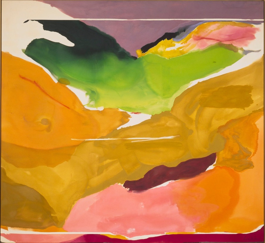
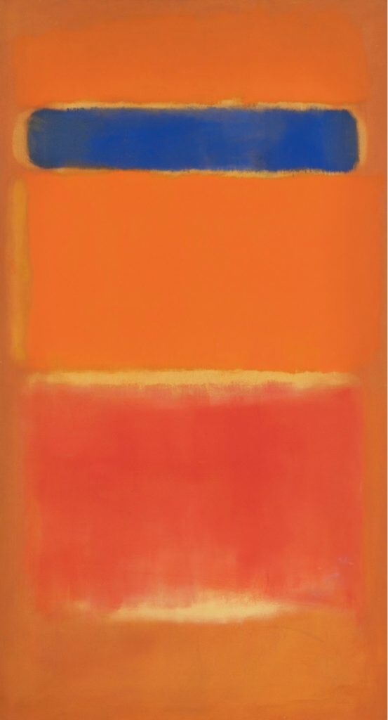
I think Ayres’s work was immersive before the term was coined, as was that of Mark Rothko. He attempted to truly immerse the viewer in his large, deeply layered and subtle “colour field” paintings beginning in the 1940’s. These are often made to glow in darkened rooms which also protect the delicate pigments he experimented with.
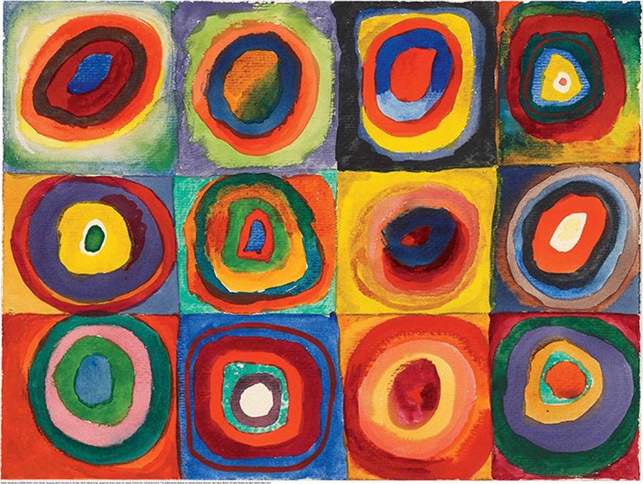
At the beginning of the last century, Russian abstract artist, Vasily Kandinsky, was using a grid to experiment with colours, circles and squares, as in his work ‘Colour Study Squares with Concentric Circles’.
Howard Hodgkin’s colours became more intense and contrasting when he began his regular visits to India where he encountered brilliantly vivid hues in bright sunshine. However he never saw his work as abstract but rather as personal recollections of very particular people, places and/or events. Critics Andrew Graham-Dixon and Katharine Arnold shed light on his work in this video.
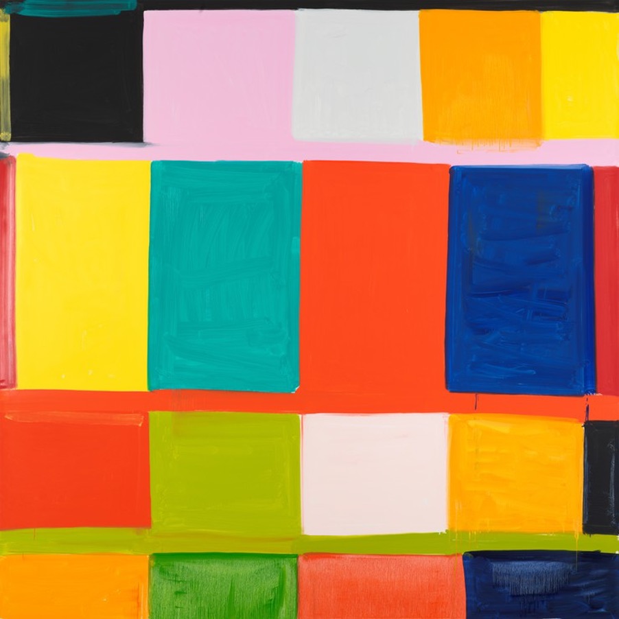
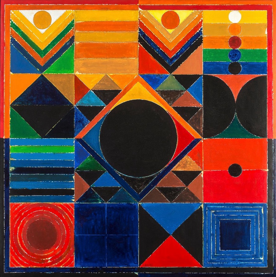
By contrast to Hodgkin, American artist Stanley Whitney begins to work from careful plans and structures, later improvising as his paintings develop, as this interview with him in his studio shows.
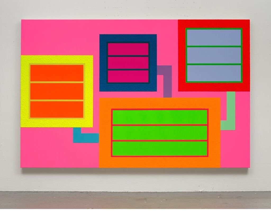
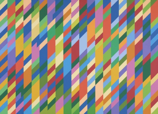
Below left, Peter Halley also employs a wide range of colour but his murals comprise sharply precise, rectangular shapes of intense pigment suggesting engineering diagrams or products. Bridget Riley, centre, uses colour to interpret musical rhythms in her astonishing OpArt designs which today we might assume to be computer-generated. There is a similar flow in the sensual colour and design choices of Chris Ofili, right.
Also planned, but from a very different starting point, are the colourful, geometric Bindu (dot) paintings of Indian painter Sayed Haidar Raza where each colour has a very specific significance in the wider spiritual context as this video about his life and work makes clear.
And to finish off, American abstract artist Helen Frankenthaler talks here about how she sees the relationship between colour, line and composition.